Sos outreach

creating more engagement for a non-profit through a desktop redesign

Timeline

3 Week Sprint

Platform

Desktop Site Redesign

My Role

Researcher
Information Architect
UX Writer

< Back

Introduction

SOS Outreach is a nonprofit with locations across America. They specialize in creating engaging outdoor activities for youth, inspiring a love of nature and an active lifestyle.

My Role

I redlined and analyzed SOS Outreach's current site design, constructed interview plans for users and spoke to stakeholders, built user flows and matrices, and wrote an in-depth case study for my team.

The problem

SOS Outreach's site is uninformative and completely blank in some places, providing few reasons to donate or volunteer with the organization.

Goals

Increase donations

increase volunteer and youth engagement

provide a user friendly interface

Research

Projects involving stakeholders are invaluable experience for a UX Professional. Our stakeholder is a jack-of-all-trades, and took the time out of her busy schedule to speak to myself and my team. Her information helped us kickstart the redesign of SOS Outreach, and better understand the great cause behind the site.

A doodle of a person smiling

Stakeholder

Kristina does amazing things for SOS Outreach. She answered all our questions and provided us invaluable data.

We assumed...

  • The website is the first introduction to SOS Outreach for mentors and mentees.
  • The website is used to generate traffic to in-person events.
  • People donate because it's a good cause.

We learned...

  • The website is not the first introduction to SOS Outreach for mentors and mentees. Traffic from in-person events is directed to the website more often than the other way around.
  • Schools organize in-person events with SOS Outreach, and since those events aren't open to just anyone, generating traffic isn't a priority.
  • People want to know more about where their money is going.
A doodle of a person looking confused

User

We imagined Mary as our Proto Persona. She's a single mom looking for after-school activities for her son, Tyler.

We assumed...

  • Mary would visit the site without any knowledge of what SOS Outreach does.
  • Mary would be unsure of whether or not to trust SOS Outreach.
  • Mary would seek out in-person events to meet the volunteers at SOS Outreach.

We learned...

  • Tyler would have received information about SOS Outreach from school before visiting the site.
  • SOS Outreach is endorsed by Tyler's school as a trustworthy organization.
  • Mary would likely have attended an in-person event before ever visiting the SOS Outreach Website.
A doodle of a person looking curious

Designer

The ability to speak to both users, and stakeholders, taught the team how to properly dissect the needs of an organization.

We assumed...

  • More CTAs = more donations.
  • Calendars are the answer to bridging the gap between events and online engagement.
  • The site should provide information regarding every aspect of SOS Outreach.
  • The site is used by kids and curious parents.

We learned...

  • Donations are driven by information.
  • We need more calendars, but most importantly, we need those calendars to stay updated with current info.
  • The site should provide minimal, impactful information.
  • The site is used by educators and members of organizations.

definition and Ideation

Asking the right questions

User Experience Design is useless without iterations. This project was one with a few backpedaling moments for the team, which brought us to a more refined user experience in the end.

“The only real mistake is the one from which we learn nothing.”

- Henry Ford

An image of a pie chart, showing 40% of users say they need to know the organization is trustworthy, 50% want to know where their donations go/how their donations make a difference, and 10% personal reasons/abilities

our process of redesigning Sos Outreach's site

These matrices, diagrams, and practices helped us stay user focused while meeting stakeholders' needs.

final phases

compromise as a goal

My team included an avid adventurer, a lover of winter sports, and myself. While I would rather walk through the snow than slide through it on a pair of death blades I think we were all equally excited about improving the interface of SOS and helping them gather in more at-risk kids, kind-hearted volunteers, and generous donations. We jumped in with both feet when we should have dipped our toes, however, and didn't immediately understand the site is more of a pamphlet for in-person events, than the main focus of SOS.

The Team decided to re-center and focus on simplification to reach our goals.

An image showing the reasons the site should act as a supporting document to in-person events. Inform and inspire users with storytelling and data
Conclusions

The decisions we made...

  • We decided to use more universal language for the calls-to-action. We removed the separation of nav bars, as well.
  • We decided to keep the donate button in the menu bar, and not as a pop-up or stationary call-to-action.
  • We decided to save the hamburger menu as leftovers.
  • We decided to incorporate more text, rather than enormous pictures or videos.

and why we made them.

  • Our stakeholders' focus on storytelling, and our users' desire to see where all their donations might go while navigating easily within the site.
  • Users' feedback that pop-ups are annoying, yet searching for a button can also be a hassle.
  • Users found it out of place on a desktop site.
  • Even high quality, gorgeous media, should be accompanied by text if for accessibility alone.
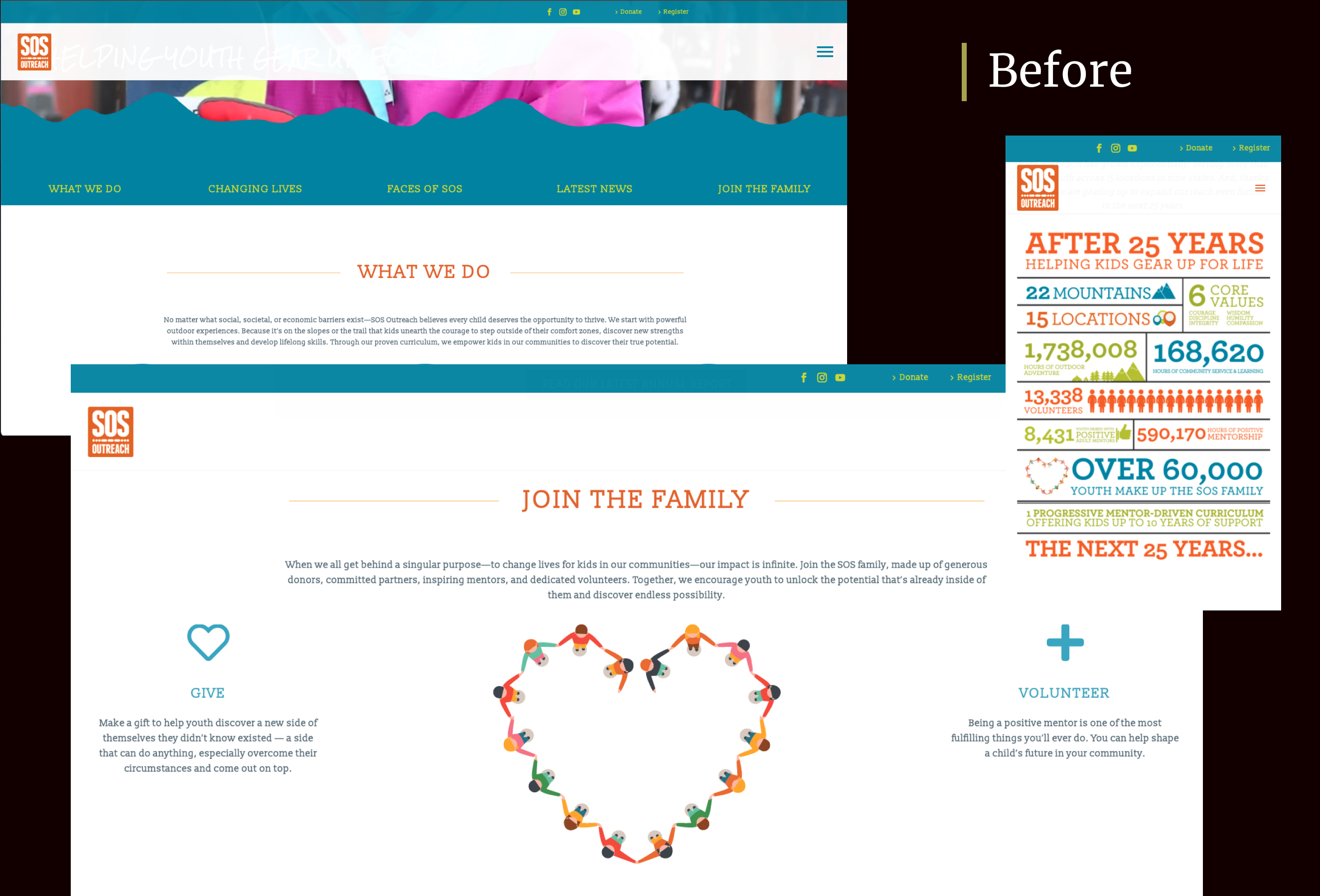
An image of the SOS Outreach site beforeImages of the SOS Outreach site before and after redesign

testing and iterating

We used 5-Second Testing and Guerrilla Testing in our final iterations. Despite our crunch for time we were able to speak to people in their 20's, 30's, and 50's. This provided us the viewpoints of those very familiar with site navigation, those somewhat familiar, and those unfamiliar.

When testing our final iteration we discovered some users would like to have more call-to-action pop-ups, but 100% of users found the site rich with storytelling, and very informative.

“I feel I could trust SOS, since I see their work is current, and affects my community. Trusting them would lead me to donate.”

- A User, after exploring our final prototype of SOS Outreach

Goals met